butter LONDON: From Local Manicure Station to Global Cult Brand
The Challenge In 2005, butter LONDON existed as a simple, localized manicure station utilizing bland, uninspired beige packaging and branding. The challenge was to completely reinvent the brand's visual identity, creating a disruptive, premium, and instantly recognizable aesthetic capable of scaling into international luxury retail environments.
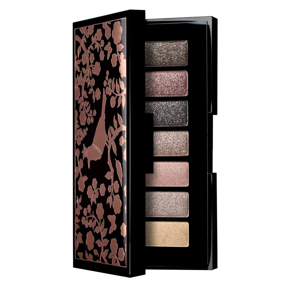
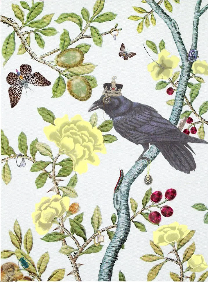
The Strategic Vision To stand out in a saturated cosmetics market, we bypassed traditional beauty tropes and introduced a high-energy, defiant "British Punk Rock Elegance" theme. We replaced the muted, generic "beige" look with an explosion of bold color, intricate custom botanical patterns, and striking high-contrast packaging layouts that commanded attention on the shelf.
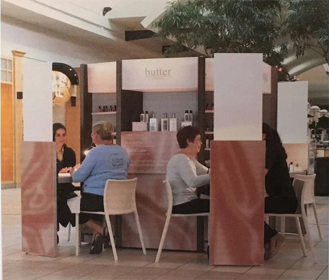
Humble (and beige) beginnings... circa 2005.
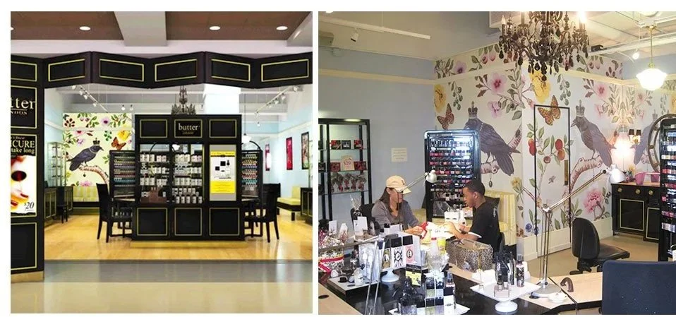
Immersive retail execution: The SeaTac airport boutique.
My Role & Leadership
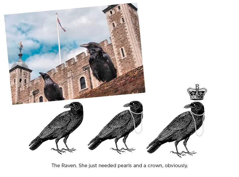
Creative Co-Direction: Collaborated closely with creative partnership to conceptualize and design iconic core brand assets, including the globally recognized raven iconography and brand patterns.
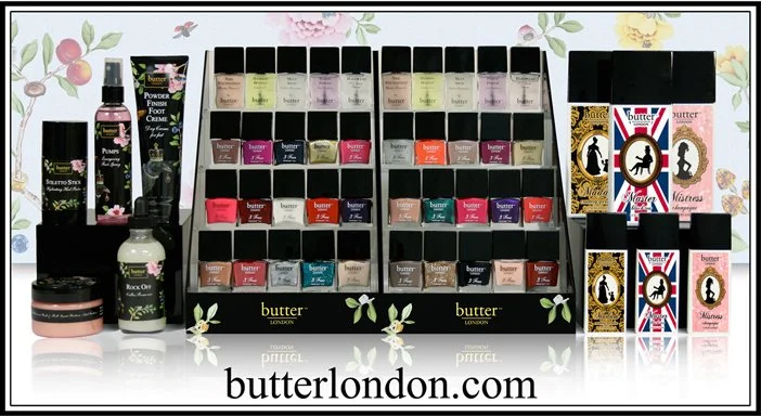
Environmental & Retail Design: Scaled the visual identity from product boxes into immersive brick-and-mortar environments, art-directing large-scale airport retail installations and high-end salon spaces.
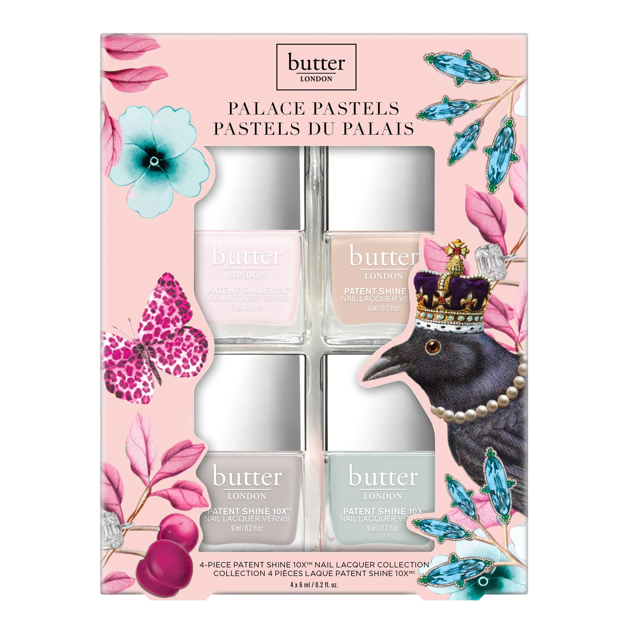
Product & Packaging Architecture: Oversaw the creative direction for massive multi-piece product rollouts, custom holiday gift sets (such as Palace Pastels and Smooth Talker), and typography standards across diverse component designs.
The Result
Successfully transitioned the company from a 'kitchen table' concept into a globally coveted beauty empire stocked by major international luxury retailers, establishing a lasting visual legacy that sustained years of massive commercial growth. By 2010 we were second in nail polish only to Chanel.